The most popular house colors to inspire your siding
Whether you’re building or remodeling, choosing new siding is an opportunity to wrap your home in a color that resonates with you.
Whether you’re building or remodeling, choosing new siding is an opportunity to wrap your home in a color that resonates with you. It’s important to think about curb appeal and resale value, but you can also express your individual style through your choices.
Just remember that when you choose a siding color, you’re in it for the long haul, according to design expert Beth R. Martin. “Since Hardie® products will last many years, you'll want to make a decision that feels timeless, not trendy" she says.
That may be why one of the most popular house siding colors in the nation is Arctic White. This clean and cool hue has a fresh feel that will appeal to anyone’s taste, even as color trends come and go. It also works well with contrasting dark trim and pops of bold accent color.
Several other neutral tones are also popular with homeowners, and these vary by region. For inspiration, we asked experts how to utilize the most popular colors in each area, so you can start visualizing the look you want for your home.
The Most Popular Exterior House Colors by Region
Midwest

- Cobble Stone (pictured)
- Iron Gray
- Aged Pewter
Bold Midwesterners may prefer the standout Cobble Stone, a warm and inviting taupe shade. Its warmth contrasts well with rich green landscaping and darker accent colors. For a more dramatic look, Iron Gray remains popular.
Jeff Akerman, licensed architect and Strategic Construction Advisor at Real Estate Bees, says these colors work well with architectural styles common in the Midwest, such as Colonial or Craftsman style homes. But he advises homeowners not to be afraid of playing with accent colors. “While neutrals are popular for their versatility and timelessness, pops of bold color can be used effectively to add personality and character to a home.”
For example, you might complement Cobble Stone with white or black shutters or trim or even a show-stopping red door.
Northeast

- Cobble Stone
- Pearl Gray
- Light Mist
In the Northeast, where the landscape is lush with greenery, homeowners turn to lighter neutrals. In addition to Cobble Stone, Pearl Gray is popular for its understated softness, while Light Mist brings a touch of blue, like a brightening sky just after a gray Northeastern rain.
“Cape Cod, Colonial, and Victorian-style homes are prevalent in the country's Northeastern region,” says Martin. “These popular styles typically use lighter shades of natural grays, taupes, and whites, making this sophisticated neutral palette common throughout the region.”
If you’re looking to add accent colors, Akerman says neutrals like Cobble Stone and Light Mist work well with earth tones like brown, beige, and green, which can reflect the natural setting to provide seamlessness between your house and the outdoors.
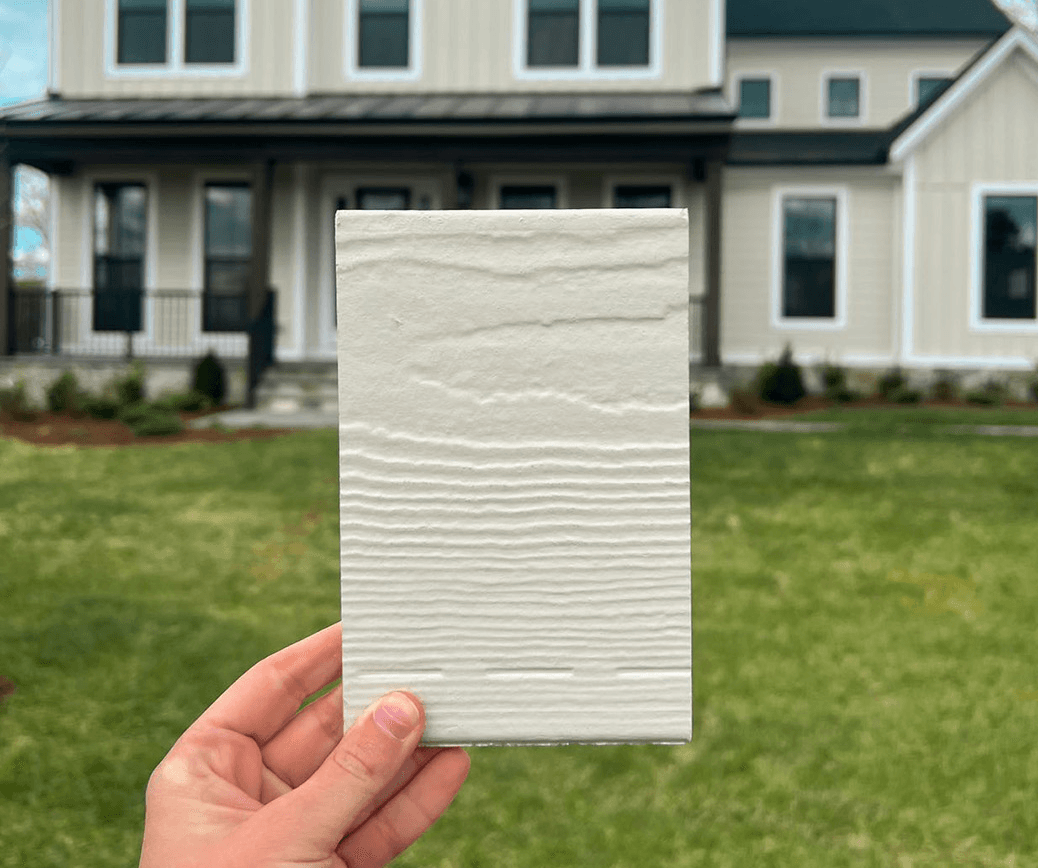
South

- Cobble Stone (pictured)
- Pearl Gray
- Light Mist
“You will also find a light, neutral color scheme in the South because of popular styles like the Modern Farmhouse and Greek Revival,” says Martin. However, she notes that more saturated colors can also be common in Craftsman Bungalow styles and homes along the coast.
Southern homeowners can pair these popular neutrals with bolder hues in the same family. For example, “Pairing Light Mist with a stark white like Arctic White will enhance this lovely hue's crisp and cool undertones,” says Martin. “Highlights of moody dark blues like Deep Ocean or Evening Blue will make your accents pop.”
South Central

- Cobble Stone
- Navajo Beige (pictured)
- Khaki Brown
Neutral colors are popular in the South Central (Texas, Oklahoma, Arkansas) region as well, but unlike other places in the country, the most popular neutrals tend towards earth tones like greys and browns. The golden, green and brown tones of the plains provide plenty of inspiration for siding house colors in the area.
“The South-Central region's bright sun brings Mediterranean-inspired architecture that uses golden, terra-cotta and earthy tones,” says Martin. “You will also find a mix of updated Ranch homes and Contemporary mod homes that look striking in the landscape, using deep dark grays and vivid whites offset by earthy hues.”
West

- Iron Gray
- Boothbay Blue (pictured)
- Cobble Stone
Unique to the West is Boothbay Blue, a striking hue in the slate family reminiscent of looking out over the ocean at dusk. Akerman suggests pairing this bold yet soothing color with lighter shades of blue, gray and white. Hues like Bar Harbor Blue or Polaris White will definitely complement the darker blue of this impactful shade.
These color combinations work well for a board-and-batten beach house or expansive ranch-style home, while more modern architectural styles may be better suited to neutrals like Iron Gray and Cobble Stone. Martin says you can pair Cobble Stone with the olive-toned Mudflats or opt for Almost Black accents for a more modern look.
Canada

- Iron Gray (pictured)
- Cobble Stone
- Aged Pewter
Akerman says French Country and Colonial style homes in Canada work well with popular siding color choices in the area. One unique option is Aged Pewter, a warmer gray tone that strikes a balance between comfort and elegance and plays well with both lighter and darker accents. “It would look best paired with a light but creamy white like Birch Tree or Gauze White,” suggests Martin. “For a significant impact, you could also accent this with a darker contrast, like Black Water.”
GRAY REIGNS SUPREME ACROSS ALL REGIONS
Why Homeowners Love Gray
Gray is a neutral that’s grown in popularity as a trending exterior house color across North America. Since last year, gray colors like Cobble Stone and Iron Gray are up by 7% and 6.5% respectively, showing that these choices continue to resonate with homeowners looking for a unique neutral that can go with anything.
Timeless Appeal
Gray’s enduring popularity comes from its ability to balance classic and contemporary styles. It works equally well on traditional and modern homes, offering a sophisticated, understated look that never feels outdated. Whether you pair it with bold accents or soft neutrals, gray siding provides a timeless foundation that enhances a home’s curb appeal for years to come.

Versatility
One of this color’s biggest strengths is its versatility. It complements nearly any architectural style, from Craftsman to Colonial, and pairs beautifully with a wide range of trim, shutter and accent colors. Whether homeowners prefer a warmer gray with beige undertones like Pearl Gray or a cooler charcoal like Night Gray, these shades offer endless design possibilities.

Adaptable to Trends
While some colors come and go, gray remains a top choice because of its enduring versatility. It pairs well with contemporary dark accents and classic white trims, allowing homeowners to refresh their exterior style without taking on a complete exterior remodel. If you choose gray for your home’s exterior, you can rest assured you’re picking a shade that will work well with any changing design trend well into the future.
CURRENT EXTERIOR HOUSE COLOR TRENDS
Two-Tone Exteriors
Looking to add depth and character to the exterior look of your home? Try a two-tone exterior. This trend combines complementary shades — like light gray with deep charcoal or soft beige with rich brown — to create visual interest.
Contrasting Trims
Bold trim colors coordinate well with many of the most popular house colors we’ve highlighted here. Dark trims like black or deep navy create a striking contrast when paired with lighter exterior colors like Arctic White or Light Mist. However, if you’ve chosen a darker siding color like Iron Gray, you can opt for a contrasting crisp white trim or even a beige to offer a classic, polished look.

Mixed Materials
Blending different siding materials is a growing trend that can add texture and dimension to the exterior of your home. Using varying textures like Hardie® trim, Hardie® plank or Hardie® shingle, you can mix and match siding to create a completely custom façade. Even playing with different textures of Hardie® siding and soffit can create areas of interest that draw the eye without distracting from the overall look.
INSIGHTS FROM JAMES HARDIE SALES DATA ON HOUSE COLOR TRENDS
Top-Selling Color
As in past years, Arctic White has dominated, accounting for 35–45% of all sales. However, this figure has declined slightly in recent years as more homeowners explore gray-based neutrals like Cobble Stone and Iron Gray, which are becoming more popular as house colors for your exterior.

Regional Standouts
While many of the most popular house colors, like Cobble Stone and Iron Gray, are consistent from region to region, some standouts showcase the unique style of each area. For example, homeowners in the West love Boothbay Blue, while the browns of Navajo Beige and Khaki Brown (pictured below) are particular favorites in the South Central area.

Emerging Trends
The emergence of grays as a popular neutral is a growing trend nationwide. Iron Gray and Cobble Stone are great examples – these shades are still vibrant and dramatic while allowing coordination with a wide variety of accent colors.

HOW TO CHOOSE A SIDING COLOR
Reflect on your home’s architectural style and surroundings: Akerman says a neutral siding color can “serve as a backdrop for other design elements, like landscaping or architectural details.” First, consider the style of your home. Then, narrow down your options to colors that complement the architecture. Finally, think about reflecting or contrasting the colors of the natural landscape in your area. You can look to other homes in the area for ideas or check out our inspiration guide.
Choose a practical color that comforts you: Choose a color that you’ll want to come home to every day, but don’t forget to consider what’s practical for your environment. “Hardie® products hold up incredibly well to the elements, but if your home is in an area with extreme direct sunlight, it's always a more low-maintenance option to select a lighter color,” says Martin. “A light color shows less wear over time, giving you more life out of your siding.”
Select your accent colors: Once you’ve selected a hue that resonates with you, it’s time to have a little fun with your color palette. “Don't be afraid to show your personality anywhere that can be repainted easily,” says Martin. “Your front door, shutters, porch ceiling and even window trim are fun places to add color without worrying about the long-term commitment.”
Consider playing with texture: You may want to use a few different siding styles to add texture and visual appeal. For example, “Using vertical siding with a complementary color as an accent on the front of the house can create an interesting texture,” says Akerman. “Additionally, using different textures like shingles, panels or trim can create a unique look.”
Martin says you’ll have plenty of options if you choose Hardie® siding. “Besides its durability, the best thing about Hardie® products is the wide variety of available textures.”
Check out our house siding gallery for ideas, or use our visualizer to see different colors and textures in action.
HOW TO PULL EXTERIOR COLORS TOGETHER
The Role of Trim Colors
Trim colors help define your home’s architectural features and tie your exterior color scheme together. Whether you choose a coordinating or contrasting trim color, each choice helps round out your color palette and enables you to shape the architectural details that define the character of your home.
Tips for Matching Roof Colors
Regardless of color, your roof should complement — not clash with — your siding. Neutral black, gray or brown roofing works with most siding colors, but for the best match, find a siding with the same undertone as your roof. If your roof has varied tones, choose a siding color that picks up one of its subtle shades for a seamless look.
Mixing Materials and Colors
Combining different materials can add texture and depth to your exterior. Balance bold contrasts using complementary colors, or go for a monochromatic palette with varying textures. For example, pairing Hardie® shingle with Hardie® plank in a warm beige like Navajo Beige creates a cohesive, inviting look.
Tools to Help Visualize Your Home’s Look
Choosing the right colors is easier with our digital tools. Our home visualizer lets you experiment with different siding, trim and accent colors to see what works best. Then, browse our siding gallery to see the combinations you like on real homes.
HOW TO ACHIEVE LONG-LASTING COLOR
Lasting color starts with choosing a durable siding product designed to withstand the elements, and there’s no question that Hardie® fiber cement siding is the optimal choice.
“James Hardie siding is particularly suited to long-lasting color because it uses ColorPlus® Technology, which bakes multiple coats of paint onto the siding for a durable and long-lasting finish,” says Akerman. James Hardie’s proprietary finish is applied in a controlled environment to avoid disruption from debris. Then, it’s cured between each coat to strengthen color adhesion. The end result is as beautiful as it is durable and resistant to chipping, peeling and cracking.
However, even with this intensive finishing process, proper maintenance is still essential to protecting the color of your exterior siding. Martin recommends washing your home’s exterior every six to 12 months to prevent mildew and other debris from building up on the surface. “Since Hardie® products are so durable and the color is actually baked onto the surface, it's only necessary to spray off your siding with a hose or power wash with very minimal pressure,” she says.
A little care goes a long way when you opt for low-maintenance Hardie® siding paired with our 30-year limited siding warranty and a 15-year limited ColorPlus® Technology finish warranty. Whether you grow old in your home, pass it on to family or sell to an excited homebuyer in awe of your exterior design, you can rest easy knowing your siding color will endure the test of time.
FREQUENTLY ASKED QUESTIONS
What is the best exterior color for a small house?
Lighter colors like Arctic White or Light Mist can make a small home feel more spacious by reflecting light and creating an open, airy look. These soft neutrals can make a small home feel larger, particularly when paired with complementary accents. To add more depth, you can also pair a light siding color with a darker trim or front door for contrast and visual interest.
Should the shutter color match the front door color?
Your shutters and front door color don’t need to match. However, they should look coordinated, which helps create a cohesive look. A monochromatic approach — using the same color for both — delivers a polished and unified appearance. However, choosing complementary shades can add personality. For example, a navy door paired with gray shutters creates a stylish contrast, while earthy green shutters and a wooden door can enhance a natural aesthetic.
How do I ensure my chosen exterior paint color will last?
Durability starts with choosing high-quality siding, such as Hardie® plank, Hardie® panel, Hardie® shingle, or Hardie® trim. Our exterior siding products are made with ColorPlus® Technology, which resists chipping, peeling and fading.
Proper maintenance also plays a role — cleaning your siding periodically and protecting it from excess moisture will help preserve its appearance.
How does natural light affect the appearance of exterior paint colors?
Sunlight can dramatically impact how a color looks on your home’s exterior. Bright natural light tends to wash out lighter hues, making them appear softer, while deeper shades may look even bolder in full sun. In shaded areas, colors may appear cooler or darker. It’s essential to test swatches at different times of the day to see how the light interacts with your chosen shade.
How can I test a paint color before making a final decision?
To ensure you love your exterior color choice, test it in multiple areas at different times of the day. Start by applying a large paint swatch (don’t skimp on the size!) directly onto your siding and observe how it looks under different lighting conditions.
Alternatively, you can use our visualizer to preview the color on your home’s exterior.
What exterior house colors are timeless?
Classic hues like Arctic White, Cobble Stone and Iron Gray have remained popular for years because of their versatility and elegance. These soft neutrals pair effortlessly with a range of architectural designs, making it easy to find accents that look great and suit your personal style.
START MY RE-SIDE PROJECT
Ready to update or renovate your home? Request a quote today to get your project started.
*Most popular colors decided by 2024 Hardie® siding with ColorPlus® technology sales figures