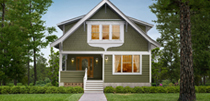
If your home has no natural way to divide colors, don't force it. Go for a less complex color combination. For inspiration for your home browse the James Hardie
ColorPlus® Technology color palette
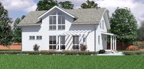
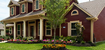
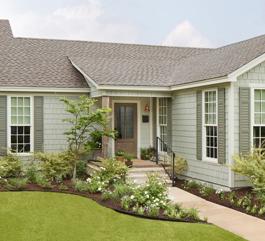
The number of colors used in an exterior color scheme depends on the home and how many details there are to highlight. Typically, traditional homes have three colors: body, trim and accent.
Newer architectural styles (and occasionally larger houses) can benefit from more than three colors. By adding a second body or trim color, you can make your home more visually appealing. These additional colors should be close to each other on the color wheel, with a slight change in value.
If your home has no natural way to divide colors, don't force it. Go for a
less complex color combination.
Tip: Don’t forget your roof. If it’s in good shape and you like it, then make sure the color of your siding goes with it. If you plan on replacing it soon, then don’t worry too much; choose colors you love, and your roof will follow suit.
Should my trim be a lighter or darker color than the body of my home?
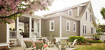
Lighter trim colors are usually the best choice, since the eye goes to the lightest color in a combination first and, in most cases, you are using trim to emphasize your house’s most interesting architectural features. (This technique of guiding the eye from light to dark was often employed on Victorian houses, making one color look like a shadow of the other.) Keep in mind that not all trim has to be the same color.
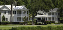
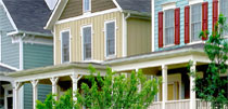
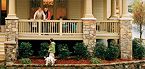
If you have horizontal or vertical banding, you may want to choose it in a different color than the trim surrounding your windows. You may also want your soffits and eaves to be a different color than your window trim. See our
photo showcase for inspiration.
Will a dark body color make my home look smaller?
A house looks smaller as a result of strong contrast in colors or using light and dark colors together. This is not always a bad thing and can actually enhance design.
If you like deeper colors and don’t want your house to look smaller, then don't use white trim; instead use a mid-tone-color trim to make the main color look brighter.
What if I don’t want to use color—am I being too boring?
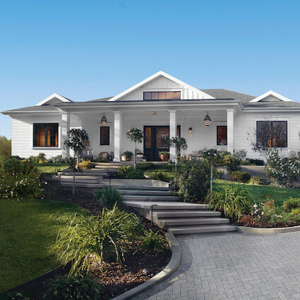
As much as color can add to a house, sometimes it looks best not to use any at all. Don't be afraid to have an all-white house. White reflects light and will actually appear to vary in tone throughout the day. Plus, you can always play with the color of your door and other visual elements such as landscaping or porch furniture that come together to create the overall look.
Should my garage door be the same color as my front door or trim?
In most cases, no! It only draws attention to the least attractive part of your home. Also, an accent color can throw off your house’s balance, making the garage look larger than it actually is. To help it blend in, select colors that are either the same as the body color, or slightly lighter or darker.